
Have you ever heard of Jakob’s Law?
In short, Jakob’s Law says that users expect a tool or website to work in a similar way to solutions they already know. The more an interface matches their previous experience, the faster they can find their way around it and the more smoothly they can use it.
That is why an effective e-learning course should be predictable and intuitive. Learners should not have to learn how to use the course – they should be able to focus on absorbing knowledge.
In this article, we will walk you through the most important principles of UX design for e-learning, explain the importance of good UX design, and show how it affects the effectiveness of online training.
1. How UX Affects Training Effectiveness?
It has long been known that good content alone is not enough to make an e-learning course effective. Just as important is how the learner uses the course, finds information, and moves between the different stages of learning.
At the same time, users’ expectations toward digital experiences keep growing. Learners compare training courses not only with other courses, but also with the apps and services they use every day. The challenge, then, is to turn the general idea of “good UX” into specific decisions when designing e-learning courses that genuinely support the learning process.
Even the best-prepared content can turn out to be ineffective if learners have trouble navigating the course. Unclear navigation, inconsistent screen layouts, or overly complicated interactions pull the learner’s attention away from learning.
This is exactly why UX in e-learning – the overall experience a user has while taking a course – plays an increasingly important role in training design. Good UX helps learners navigate the course intuitively, find the information they need faster, and focus on reaching their training goals.
It has long been known that human working memory has limited capacity. This means that every extra effort spent operating an interface reduces the resources a learner can devote to processing and remembering new information. Every additional effort related to using the interface reduces the amount of resources that can be devoted to processing and remembering new information.
That is why effective online training should be not only substantive, but also easy to use. The less energy a learner spends understanding how the course works, the more they can devote to actually learning.
2. What Is UX in E-learning?
When people talk about UX in online training, many immediately think of attractive graphics or a modern-looking course. In reality, User Experience is far more than aesthetics.
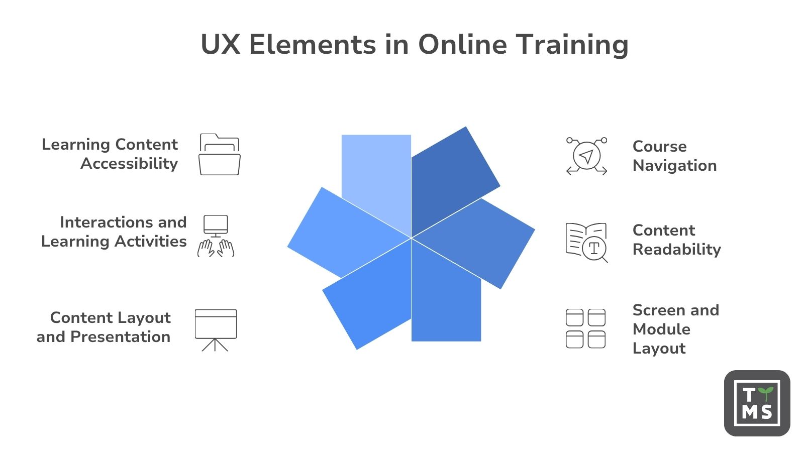
UX in online education covers every experience a learner has while taking a course, from launching it for the first time to completing the final task:
- navigating the course,
- readability of the content,
- the layout of screens and modules,
- how information is presented,
- interactions and exercises,
- accessibility of the materials.
A well-designed E-learning UX means the learner intuitively knows what to do next. They don’t need to wonder where to find the information they need or how to move to the next lesson. This lets them concentrate on learning instead of spending attention on operating the platform or the course itself.
In practice, this means effective e-learning should be simple, consistent, and predictable. The less effort a course requires to use, the greater the chance a learner will finish it and remember the content presented.
2.1 E-learning UX – What It Is and What It Is Not
| UX is… | UX is not… |
| Designing the learner’s experience while taking the course | Just attractive graphics |
| Creating intuitive, predictable navigation | Adding lots of animations and visual effects |
| Making it easier to find information and complete tasks | Making the interface more complicated with extra features |
| Reducing the learner’s cognitive load | Forcing the user to learn how to operate the course |
| Keeping content readable and materials logically organized | Cramming as much information as possible onto one screen |
| Designing interactions that support the learning process | Adding interactions just because they are trendy |
| Making training accessible to different groups of users | Designing only for the most advanced learners |
| Helping learners reach training goals faster and more easily | Focusing only on how the course looks |
3. When Does a Learner Stop Learning?
Imagine a learner who has just started an online course. Instead of focusing on the content, they are wondering:
- where to click,
- how to move to the next module,
- where to find the information they need,
- how to go back to the previous lesson,
- why they can’t start an exercise.
At this point, their attention is no longer on learning. The cognitive resources that should be used to process and remember new information are instead spent on operating the interface.
The limits of working memory can be described with a few rough figures. Depending on the type of task, a person can process only a few new, related pieces of information at once. Research most often points to around three to five items, when a learner cannot rely on repetition or previously built knowledge structures (Cowan, 2010).
These are, of course, average values. The capacity of working memory depends on things like the type of task, prior knowledge, and the ability to combine individual pieces of information into larger, meaningful groups. That’s why this figure shouldn’t be treated as a strict limit that applies to every user in every situation (Cowan, 2010).
The limited capacity of working memory has a direct impact on how educational materials should be designed. Cognitive Load Theory, developed and updated over several decades, shows that the way information is organized and the learning environment is built can make it either easier or harder to process new content (Sweller, van Merriënboer and Paas, 2019).
In a digital environment, some of these limited resources can be used up by elements that have nothing to do with the training content itself: looking for a button, interpreting unclear icons, switching between scattered pieces of information, or remembering how an interaction works. Research on Cognitive Load Theory in educational technology shows that interface design, the way multimedia is used, and how content is organized can all affect a learner’s cognitive effort and how effectively they learn (Sweller, 2020).
From the perspective of UX design for e-learning, this means the interface should leave as much attention as possible for understanding the material. The more energy a learner spends orienting themselves in the course and operating its elements, the less they have left for processing new information and building knowledge. That’s why UX is one of the factors that directly affects how effective a training course is.
TTMS expert comment:
When we try to build a course without proper methodological groundwork, we fall into a certain trap. We create content based on what we already know, while our audience is often building their knowledge from scratch, like a delicate scaffold.
As a result, it’s easy to make mistakes such as delivering knowledge in portions that are too large, lacking a clear goal (and therefore effective selection of information), and overloading the course with “engaging” elements – animations, images – that in reality distract the user.

4. Why the Brain Doesn’t Like Chaos
As mentioned earlier, both research into user experience (UX) and Cognitive Load Theory show that people learn more effectively in an organized environment. It’s not just about the amount of information, though – it’s mainly about how it’s presented.
The human brain doesn’t process every stimulus at once. It constantly has to choose which information is important and which can be skipped. When too many elements compete for attention on the screen, this process becomes less effective.
In online training, chaos can take several forms:
- too much information on a single screen,
- several messages displayed at the same time,
- too many animations and visual effects,
- an overly complicated course structure,
- an unclear menu,
- an inconsistent layout across modules.
Each of these elements requires extra effort from the learner. Instead of focusing on new information, they have to spend attention organizing content, searching for information, or figuring out how the course works.
This is confirmed by Richard E. Mayer’s research on multimedia learning. Mayer showed that learners get better results when educational materials include only elements that support the learning goal. Extra graphics, animations, or messages that add no educational value can pull attention away from the most important content.
Similar conclusions come from research on the so-called “paradox of choice.” Psychologist Barry Schwartz showed that having too many available options makes decision-making harder and increases user frustration. In e-learning, this can mean that an overly complex menu, multiple navigation paths, or too many features make a course harder to use rather than easier.
4.1 Less Isn’t Always Better
When designing online courses, minimalism shouldn’t be a goal in itself. Removing too much content can mean learners don’t get all the information they need to do their job or understand a topic.
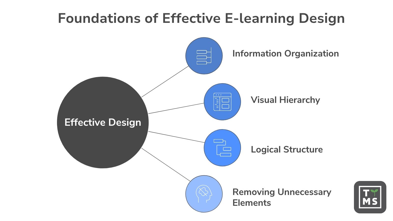
Good design is about something else – organizing information the right way. Grouping related content, creating a clear visual hierarchy, applying a logical structure, and removing elements that don’t support the learning process.
The goal isn’t to create the simplest possible course. The goal is to create a course that the learner can easily understand and process effectively.
TTMS expert comment:
Why are so many health-and-safety training courses boring and overloaded with information? Because their goal often isn’t to change behavior, but to pass on everything that might one day come in useful. This gives the organization a sense that it has fulfilled its obligation. As a result, learners get a huge amount of content, of which they remember very little.
I was lucky enough to work with a client who looked at safety differently. What mattered to them wasn’t formally checking a training box, but making sure employees made better decisions in real situations.
That’s why we left the extensive knowledge available in clear documentation and instructions, right where it was needed. We turned the training itself into a decision-based game where learners discover the consequences of their choices – with humor, light animations, and sound. Thanks to a repeatable structure, we cut navigation down to the required minimum, leaving room for full engagement with the content.
The result? Learners focused on what really improves safety. I also believe the humor meant that conversations about safety kept going after the training ended.
5. Readability of Materials and Knowledge Retention
Many course authors assume that learners read every piece of information from start to finish. In reality, it usually looks quite different.
Most users don’t read content word for word. They scan it first, looking for the most important information, headings, highlights, and reference points. Only then do they decide which parts deserve more attention.
This phenomenon has been well documented in usability research carried out by Jakob Nielsen. Analyses of user behavior showed that when using digital content, people mostly scan web pages instead of reading them in full. This means how information is presented has a direct effect on whether a learner notices and absorbs the key content.
In addition, eye-tracking research – conducted among others by Keith Rayner (1998) – showed that a user’s gaze doesn’t move across a screen continuously. Viewers jump between points that catch their attention and help them quickly understand the structure of the content. The clearer the layout of the material, the easier it is to find the most important information.
5.1 What Improves the Readability of Training Materials?
The readability of a course is affected by many seemingly small elements related to e-learning UX design. These are often exactly what decides whether a learner stays focused on learning or starts feeling tired and frustrated.
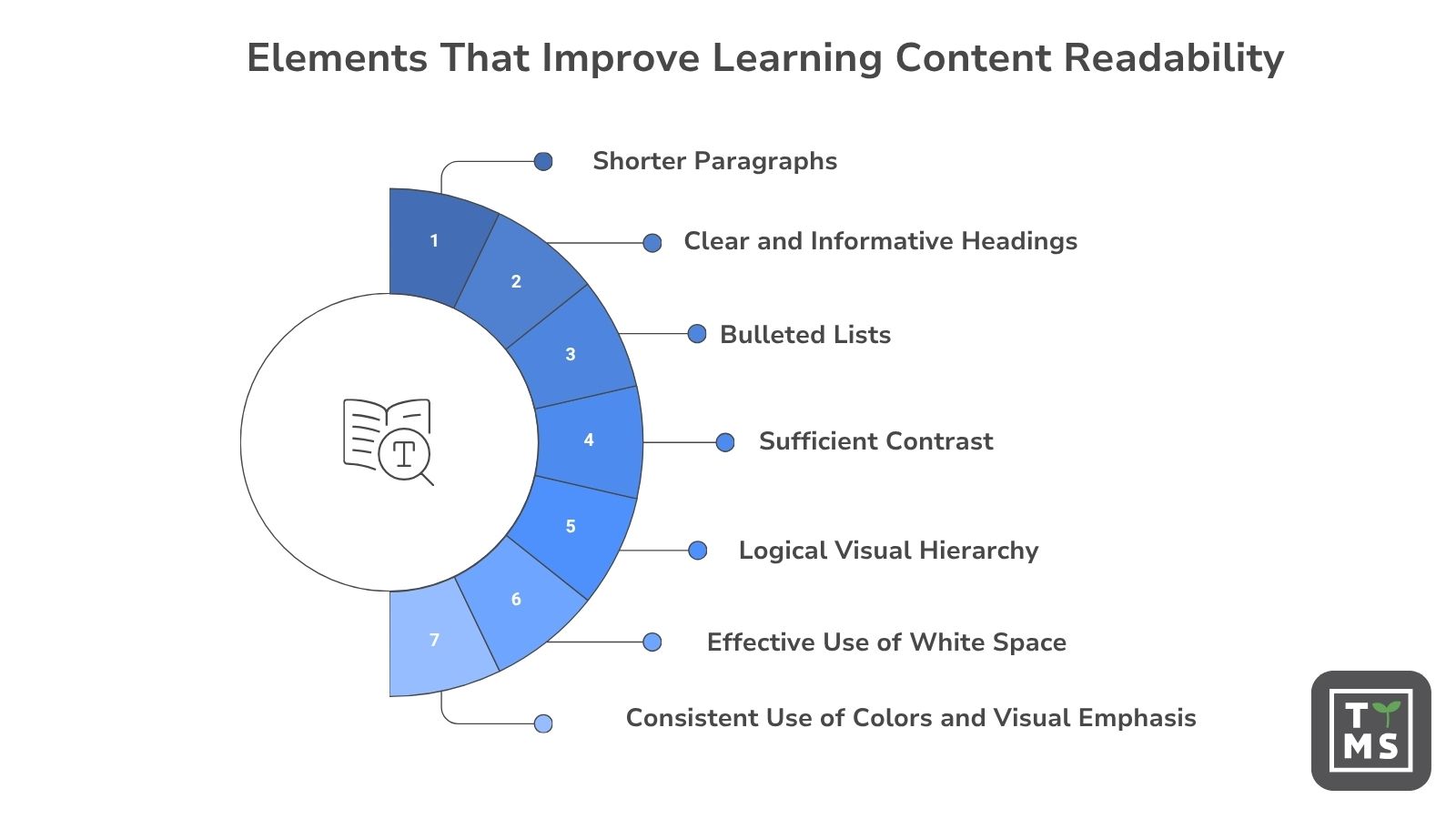
The most important factors are:
- shorter paragraphs,
- clear, informative headings,
- bullet lists instead of long blocks of text,
- good contrast between text and background,
- a logical visual hierarchy,
- enough white space between elements,
- consistent use of colors and highlights.
Current research in cognitive psychology and instructional design shows that learners learn more effectively when new information is presented as logical, coherent units of knowledge that can easily be connected to prior experience and existing cognitive schemas (Mayer, 2021, Fiorella & Mayer, 2015).
In practice, this means designing e-learning courses shouldn’t start with cutting finished content into smaller pieces. It’s far more important to first work out which pieces of knowledge the learner needs to understand, how they connect to each other, and in what order they should best be presented. Only then does it make sense to build the structure of modules, screens, and lessons.
5.2 How Do You Design Training Screens? – A Practical Checklist
Before publishing a course, it’s worth checking every screen against a few basic rules:
- □ Can the learner understand the main message of the screen within a few seconds?
- □ Is the most important information visible without having to read through the whole content?
- □ Are the paragraphs short and easy to scan?
- □ Do the headings clearly describe what the section contains?
- □ Is the number of elements on the screen kept reasonable?
- □ Do the graphics support learning rather than serve a purely decorative function?
- □ Do contrast and text size allow for comfortable reading?
- □ Does the learner know what they should do next?
- □ Does the screen look consistent with the rest of the course?
- □ Have elements that might distract attention been removed?
A well-designed screen doesn’t have to be minimalist. It should, however, guide the learner through the content in a natural, predictable way. When users don’t have to wonder where to focus their attention, they can concentrate on what matters most – learning.
TTMS expert comment:
The most important rule for designing training screens? Don’t design screens – design the user experience. 🙂
Of course, there are plenty of design principles, best practices, and templates out there, and that’s exactly why designers are needed. But if you catch yourself asking “where do I fit this text in?” or “how do I squeeze in all these buttons?”, that’s a sign it’s worth stepping back and asking:
What should the user learn from this screen, and why do we want them to know it?
Does the user know what this screen is for, can they find their way around it, and do they know what to do next?
This approach has very concrete design consequences: dropping elements that don’t support the goal, a clear information hierarchy, and designing navigation and interactions so they work like an invisible tool – meaning they don’t unnecessarily draw attention to themselves, but are intuitive and predictable enough to direct that attention to the actual content of the training.
6. Why Design Matters?
Learners don’t judge training on content alone. They also judge how that content is presented.
From the very first screens of a course, learners form an opinion about an organization’s professionalism, the quality of the materials, and the credibility of the knowledge being shared. That’s shaped not just by what the training contains, but also by how it looks.
This phenomenon is partly explained by the halo effect described by Edward Thorndike. It means a positive impression of one feature affects how other aspects of a product or experience are perceived. If a course looks professional, consistent, and credible, learners may rate the quality of its content more highly right from the start.
More recent research into digital products and e-learning environments shows that aesthetics and interface quality mainly affect a user’s subjective experience – their trust, satisfaction, and perceived usability. That doesn’t automatically mean a more attractive course leads to better learning outcomes. A positive first impression, though, can make it easier to engage with the material, reduce distrust, and increase a learner’s willingness to commit to the following stages of training (Peng et al., 2021, Pham et al., 2019).
Similar conclusions come from Robert Cialdini’s research (1984) on the principle of authority. People are more willing to trust information that comes from sources they see as professional and credible.
That’s why a logo, brand colors, or a consistent visual identity aren’t just marketing elements. They help build a sense of order, professionalism, and trust that supports a positive learning experience.
TTMS expert comment:
If we care about building employee engagement and loyalty, consistent branding really matters. From the employees’ point of view, it’s important that the training doesn’t feel like it’s coming from outside, but feels like part of the world they operate in every day.
At the same time, I very often persuade clients that in e-learning it’s worth loosening strict branding rules a little and leaving room for a subtle element of surprise in the visual layer. It’s exactly these moments that help switch the brain’s attention from automatic processing to more active engagement. At the level of brain chemistry, they support engagement, focus, and memory retention. That’s why the best training courses combine two things: the familiar world of the brand, and an element that makes people want to pause for a moment longer.
7. UX and Learner Engagement
Engagement in online training doesn’t depend only on the topic of the course. How easily learners can use it matters just as much.
Users often abandon training when modules are too long, the interface is unclear, using the course takes too many clicks, or a learner doesn’t get clear feedback after completing a task. In situations like this, the problem isn’t a lack of motivation – it’s a poorly designed learning experience.
Good UX helps hold the learner’s attention because it guides them through the course step by step. A clear learning path, predictable navigation, consistent interactions, and fast feedback let users know where they are, what they’ve already done, and what to do next.
In practice, engagement grows when a course is simple to use, easy to read, and gives learners a sense of progress. The less frustration there is with the interface, the higher the chance a user will finish the training and actually make use of its content.
Good e-learning platform UI/UX helps users focus on learning instead of forcing them to deal with problems related to operating the interface.
7.1 UX and Learner Engagement – What Helps and What Gets in the Way?
| Factors that lower engagement | Factors that increase engagement |
| Training modules that are too long | Shorter modules that are easy to finish |
| Complicated course navigation | Intuitive, simple navigation |
| An unclear interface | A clear, transparent screen layout |
| No feedback | Fast feedback after completing a task |
| Inconsistent module design | Consistent design throughout the course |
| An unclear learning path | A clearly defined next step |
| Too many decisions to make | A predictable training flow |
| Distracting visual elements | Content focused on the learning goal |
| Difficulty finding information | Easy access to materials and resources |
| Frustration with the interface | A sense of progress and control over learning |
TTMS expert comment:
What matters most is the feeling that the training content is useful and reflects the learner’s everyday work. The role of good UI is mainly to stay out of the way. Users shouldn’t have to fight the interface – they should be able to focus on learning.
One example is forcing a fixed pace on the course. Making users wait for narration to finish, or blocking access to the next screens, can lead to frustration and loss of motivation. On the other hand, a pace that’s too fast increases cognitive load and lowers the learner’s sense of competence.
The same goes for animations. Too much movement, flashy transitions, or flickering elements can distract and irritate people, and for some can even cause real discomfort. On the flip side, a screen that’s too static, lacking contrast and points that draw the eye, makes it easier to lose focus.
That’s why it’s worth designing courses with the right pace and the right amount and intensity of stimuli in mind, while still giving users control – through free navigation, the ability to adjust playback speed, or the choice between reading and listening to content.
8. UX in the Age of AI – Does Automatically Generating Courses Solve the Problem?
The rise of AI tools has made building an e-learning course faster than ever. A handful of documents, a presentation, or a set of procedures is now enough to generate ready-made training material within minutes.
It’s worth remembering, though, that generating content isn’t the same as designing a good user experience.
AI can help create modules, lessons, quizzes, and summaries. That doesn’t automatically mean, however, that learners will navigate the course intuitively, easily find the information they need, and stay engaged throughout the whole learning process.
Whether a course follows the most important UX principles for designing e-learning courses depends largely on the tool being used and how the course is put together. Among the things that matter are:
- a clear module structure,
- a logical breakdown of content,
- a consistent screen layout,
- clear navigation,
- the right amount of information per screen,
- consistent interactions and messages.
This is exactly why modern tools and platforms increasingly build UX design principles for e-learning into the course-generation stage itself.
AI4E-learning is one example of this approach. The app is designed to turn the materials it’s given into well-organized courses that follow good practices of UX design in e-learning right from the start.
AI4E-learning automatically organizes content, splits material into modules, builds a clear lesson structure, and helps keep the whole course consistent. This lets organizations build courses faster – courses that are not only rich in content, but also easy for learners to follow.
Importantly, the solution is also backed by a team of TTMS experts who support organizations in designing effective training programs. Combining AI technology, the experience of Instructional Designers, and the knowledge of e-learning specialists makes it possible to create training that meets both business requirements and user expectations.
AI can significantly speed up the process of building courses. Even so, it’s still the quality of the design, the structure of the content, and the learner’s experience that decide whether the training is effective. The best results come when automation supports good design practices instead of trying to replace them.
TTMS expert comment:
For courses built with the help of AI, the role of UX becomes especially important, because automation can very quickly replicate both good solutions and design mistakes. If the generated structure is unclear, the interactions are inconsistent, or the content doesn’t match how the audience actually works, the same problem can turn up right away across many modules.
That’s why an AI-generated course should be treated as material that needs validation. It’s worth checking whether users understand the structure of the training, can predict how individual elements behave, and know what to do next without extra instructions. UX therefore helps not only to design a course, but also to judge whether an automatically generated solution actually works from the learner’s point of view.
The checklist below sets out the most important UX principles for e-learning worth considering before publishing a course.
9. The Most Important UX Principles for E-learning – A Practical Checklist
| Area | Good practice |
| Navigation | The learner always knows where they are |
| Content | One main idea per screen |
| Graphics | Support learning, don’t just decorate |
| Interactions | Consistent throughout the course |
| Branding | Consistent with the organization |
| Mobile | The course works on different devices |
| Feedback | The user gets feedback |
10. What Does Good Design Mean in Modern E-learning?
Modern e-learning is far more than an attractive-looking course or the ability to generate content quickly with AI. What still decides whether a training program is effective is mainly how the learner experiences the learning process.
A well-designed course helps users focus on the content, not on operating the interface. It guides the learner through the material intuitively, reduces unnecessary cognitive load, and makes it easier to find the most important information.
That’s why, despite the rapid development of AI tools, the role of instructional design and UX in online education remains just as important as ever.
10.1 Key Takeaways for Course Creators
- Design the course so the learner doesn’t have to learn how to use it.
- Keep a consistent structure for screens, modules, and interactions.
- Limit elements that don’t support the training goal.
- Break content down into smaller, easier-to-absorb parts.
- Use clear headings, short paragraphs, and bullet lists.
- Take care of content readability and a proper visual hierarchy.
- Give learners a clear learning path and feedback.
- Build trust through a consistent look and professional visual identity.
- Design training with the user in mind, not just the material.
- Treat AI as support for the design process, not a replacement for it.
Ultimately, good design in e-learning isn’t about making a course look modern. It’s about helping the learner learn faster, more effectively, and with less effort. This is exactly where UX, instructional design, and modern technologies supporting skills development come together.
10.2 Key UX and Accessibility Principles in E-learning – A Practical Checklist
Before publishing a training course, it’s worth checking whether it guides the learner through the material intuitively, limits unnecessary cognitive effort, and is accessible to different groups of users.
Navigation and User Interface
- ☐ Does every screen have one clearly indicated main action?
- ☐ Does the learner always know where they are in the course structure?
- ☐ Do they have easy access to the main menu and to parts of the training they’ve already visited?
- ☐ Are navigation buttons such as “Next” and “Back” placed in fixed, predictable locations?
- ☐ Does the course clearly show the learner’s progress?
- ☐ Does the user know what step to take once they’ve finished a given screen or module?
- ☐ In larger training programs, can users easily find the module, topic, or material they need?
- ☐ Does the user interface work consistently across all parts of the course?
Readability and Information Hierarchy
- ☐ Does each screen convey one main idea or serve a clearly defined purpose?
- ☐ Can the most important information be spotted quickly, without reading through all the content?
- ☐ Are the paragraphs short and easy to scan visually?
- ☐ Do the headings clearly signal what the following sections contain?
- ☐ Has the content been broken down into logical, coherent units of knowledge?
- ☐ Does the visual layout show which information is most important and which is supplementary?
- ☐ Is there enough white space between elements?
- ☐ Has the number of fonts, colors, and types of highlights been kept limited to preserve consistency?
- ☐ Do graphics, animations, and multimedia support the training goal instead of serving a purely decorative function?
Training Accessibility
- ☐ Does the text stay readable thanks to good contrast against the background?
- ☐ Is the text size comfortable to read on different devices?
- ☐ Do all important graphics have alt text for screen readers?
- ☐ Can every feature of the course be operated using a keyboard?
- ☐ Do audio and video materials have captions or a transcript?
- ☐ Is color never the only way information is conveyed – for example, a correct answer, an error, or task status?
- ☐ Does the course work correctly on a computer, tablet, and mobile device?
- ☐ Do flashing elements, intense animations, or auto-playing media avoid causing discomfort?
Interactions and Feedback
- ☐ Are interactions used only when they support the learning process?
- ☐ Do similar actions work the same way throughout the course?
- ☐ Does the learner get clear feedback after completing a task?
- ☐ Does the feedback explain why an answer is correct or incorrect?
- ☐ Are buttons and other interactive elements large enough to select easily?
- ☐ Can the user pause, resume, or mute audio and video materials?
- ☐ Can the pace of the training be adjusted to individual needs?
- ☐ Can the user go back to earlier content without losing their progress?
- ☐ Does the course save progress automatically?
Managing Cognitive Load
- ☐ Have elements that don’t support the training goal been removed?
- ☐ Does the learner avoid having to remember how to operate the course while completing a task?
- ☐ Is the screen free of too much information, too many messages, and elements competing for attention?
- ☐ Is content presented in an order that makes it easier to build knowledge?
- ☐ Can new information easily be connected to the learner’s prior knowledge or experience?
- ☐ Does the course avoid forcing users to wait for animations or narration to finish when it isn’t necessary?
- ☐ Does the learner have enough control over the pace, navigation, and way they take in the material?
Visual Consistency and Branding
- ☐ Is the training visually consistent with the organization’s identity?
- ☐ Does the branding support a sense of credibility and belonging to the work environment?
- ☐ Do the brand colors avoid reducing the readability of the materials?
- ☐ Do screens, buttons, and interactions look consistent throughout the course?
- ☐ Do the visual elements build trust without pulling attention away from the content?
Course Validation
- ☐ Can the learner understand the structure of the training without extra instructions?
- ☐ Can they predict how buttons and other interface elements will behave?
- ☐ Do they know what to do at every stage of the course?
- ☐ Has the training been tested on people similar to its target audience?
- ☐ Has a course generated with AI been checked for readability, consistency, and fit with learners’ needs?
Well-designed UX in e-learning guides the learner through the course in a natural, predictable way. The user interface shouldn’t draw attention to itself. Its job is to make learning easier, reduce frustration, and leave as many cognitive resources as possible for understanding the material.
FAQ
How UX Affects Training Effectiveness?
UX in e-learning reduces cognitive load, makes navigation easier, and lets learners focus on learning instead of operating the course. Good UX design guides the learner through each stage of the training, clearly points to the next step, and helps them quickly find the information they need. An intuitive structure, a clear user interface, and predictable interactions increase the chances of finishing the course and effectively absorbing the content.
Why is the readability of materials so important when designing e-learning courses?
The readability of materials matters a great deal for how the learning process unfolds. Short paragraphs, informative headings, a logical visual hierarchy, and enough white space make it easier to scan content and find the most important information. This lets the learner understand the material faster and spend fewer cognitive resources on getting their bearings in the course.
How important is UI/design when choosing online training?
UI, or the user interface, together with design, can shape a learner’s first impression of an online course’s quality and its author’s credibility. A consistent look, a clear structure, and intuitive operation build user trust and make it easier to get started with learning. On its own, though, attractive design doesn’t guarantee that a course will be effective. It should support the learning goals and guide the learner through the content, rather than pulling attention away from it.
Does branding in online training matter for the user experience?
Yes. Consistent branding helps an online course feel like an integral part of an organization’s work environment and communication. Familiar colors, typography, and visual identity elements can build trust and strengthen a sense of consistency. Branding should, however, stay subordinate to content readability and the principles of user-centered design.
What are the most common UX mistakes in e-learning?
The most common UX mistakes in e-learning include unclear navigation, screens overloaded with content, too many animations, inconsistent interactions, and a lack of clear information about the next step. Another issue can be a user interface that takes too many clicks or forces the learner to figure out how the course works. These problems increase cognitive load, cause frustration, and make learning harder.
Does attractive design increase knowledge retention?
Attractive design on its own doesn’t guarantee better knowledge retention. Still, an aesthetic, consistent course can build trust, improve the user experience, and make it easier to concentrate. Good UX design supports learning when it organizes information, shows its hierarchy, and helps the learner focus on the training goal. Unnecessary graphics, animations, and visual effects, on the other hand, can distract attention.
How should courses be designed according to the principles of UX in e-learning and Cognitive Load Theory?
Designing e-learning courses should take the limited capacity of working memory into account. In practice, this means organizing content logically, breaking material into coherent units of knowledge, removing unnecessary elements, and building a clear user interface. User-centered design also assumes that a course guides the learner through each stage of learning and doesn’t leave them guessing where to click or what to do next.
Can AI design an effective e-learning course on its own?
AI can significantly speed up the creation of courses, lessons, quizzes, and summaries, but it doesn’t automatically guarantee good UX. The effectiveness of online training still comes down to content structure, the clarity of the user interface, how information is presented, and how well the course fits the audience’s needs. Material generated by AI should be checked to make sure it guides the learner intuitively, supports the learning process, and meets real training goals.