Many TTMS clients come to us with a similar problem: “we have data, but nothing comes of it.” Inconsistencies between reports, human error, and unintuitive visualizations that require additional instructions are commonplace in many organizations. Reports are often created in a rush, without understanding the business objective, causing recipients to spend more time interpreting than making decisions. Instead of supporting management, they become a bureaucratic obligation that generates more frustration than value.
This problem isn’t confined to a single industry. Financial corporations, technology companies, and public institutions face similar challenges. Where data flow is intense, the lack of a consistent reporting philosophy leads to decision-making paralysis. Many organizations have extensive data infrastructures, but without proper interpretation and context, even the best Power BI reports they don’t deliver the expected value. Data then becomes like a map without a legend – accessible but useless.
1. What organizational problems can Power BI reports solve?
This was the case for one of Europe’s largest charities, for which TTMS created a complete reporting ecosystem. Each year, the organization organizes thousands of events that must be recorded, approved, and submitted for audit. Employees were under time pressure, and different departments were using disparate data sets. The previous SharePoint-based system required manual entry and tedious copying of data between files. This led to errors, omissions, and delays, and the audit team had to spend dozens of hours correcting them.
As a result, specific problems emerged:
- preparing data for the audit took weeks and involved many departments,
- key KPIs were known with a delay, which made it difficult to respond to deviations,
- the lack of automation meant that users avoided using the system, which was rather a hindrance than a help,
- and reports that should support the organization’s mission became another administrative burden.
The situation required more than just a change of tool – it needed changing the approach to data TTMS proposed a solution that combines technology with philosophy: the report should not only be a source of information, but also a guide to decisions and a catalyst for action. Reports that really work.
2. Interactive Power Bi Reports: From Data to Decisions
Modern business is drowning in data, but true value only emerges when we understand it and translate it into concrete actions. Interactive Power BI reports enable much more than just visualizing information—they help companies discern relationships, identify trends, and make better business decisions.
Many organizations still struggle with reports that, instead of supporting decision-making, are merely collections of colorful charts without context. Despite investments in data, decision-makers continue to struggle with a lack of transparency, poor information quality, and slow response times.
Why is this happening? Because reports are often not designed with the user and their business needs in mind. They answer technical questions rather than solve real-world problems. At TTMS, we believe that an interactive Power BI report is not a document, but a digital product—a tool that guides the user through data, suggests conclusions, and inspires action. We put this philosophy into practice by creating reports that combine aesthetic appeal, intuitiveness, and real analytical value.
3. Why companies need good and effective reports
Every organization, regardless of industry, sooner or later faces the same challenge: too much data, too little time. Finance, operations, sales, and HR teams generate dozens of spreadsheets and reports daily. However, without appropriate visual and conceptual design, data loses meaning. Instead of supporting decisions, it creates chaos and information noise. Decision-makers often spend hours searching for the right metric, unsure which report is current and presents the data in the correct context.
3.1 What does it mean for a report to be good and effective?
Good reports are those that they simplify reality without simplifying the data. They answer questions like: What’s happening? Why? What’s next? They help understand trends, capture relationships, and make decisions faster. Only then do data cease to be mere numbers and become a tool for change. This is the philosophy that guides TTMS.
In our practice, we often see companies trying to “beautify” reports instead of simplify.The result is visually appealing dashboards that don’t support decisions. The true value of a report lies in its logic – how it guides the user, the emotions it evokes, and how quickly it allows for understanding the situation and making decisions. At TTMS, we design effective Power BI reports so that every element – color, layout, filter, interaction—is meaningful and directs attention where it should be.
3.2 Five Principles of Effective Reporting
Our approach to reporting is based on five pillars:
- Purpose – A report must clearly address the recipient’s needs and lead to action. Every screen and indicator has a purpose – if it doesn’t add value, it shouldn’t be there.
- Short time to action – The most important data must be visible immediately. Users shouldn’t have to search for information – the report should provide it at the right moment.
- Appropriate information density – the report encourages exploration without overwhelming. Information is presented in layers, from general to specific, so everyone can find what they need.
- Attention to detail – every element has a purpose, supports UX, and reinforces the message. Even the background layout, typography, and visual legend are important for the clarity of the message.
- Adjusted to audience – The report is intuitive, understandable, and reflects the user’s mindset. We take into account the industry, team workflow, business context, and audience level.
These rules allow you to create Power BI reports that are living business tools– they support planning, controlling, analysis, and strategy. Every well-designed report is like a common language in which a company begins to communicate about data. Instead of interpreting charts differently, everyone sees the same facts and draws consistent conclusions.
More and more organizations are realizing that a good report is a competitive advantage. It helps them respond faster to market changes, spot opportunities earlier than their competitors, and build a fact-based culture. Power BI reports created according to the TTMS philosophy become not only a source of information but also a platform for dialogue, collaboration, and a shared understanding of the organization’s goals.
Our clienthe neededchanges in reporting philosophy, not just a new tool.
-
- Raport w Power BI
4. Power BI Reports as a Digital Decision Assistant
In TTMS, in-depth analysis led to the creation of a solution based on Microsoft Power Platform – Power Apps, Power Automate i Power BI.The goal was to create not only a report, but a system that thinks together with the user, anticipates their needs and eliminates moments of uncertainty. Instead of providing users with raw data, we decided to build an environment in which information is organized, contextual, and ready for action.
4.1 The role of Power Apps in creating reports
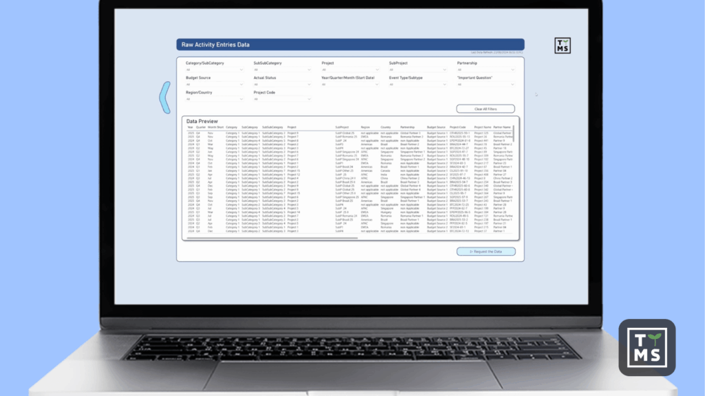
Power Apps simplified the data entry process, eliminating errors associated with manually retyping information. Forms were designed for simplicity and automatic data validation. Power Automate took over sending reminders and monitoring deadlines, allowing for the setting of custom rules. For users, this meant no more tracking emails and Excel spreadsheets – the entire process became automatic.
4.2 Microsoft Power BI – Transparency and readability are key
Power BI has become the heart of the entire ecosystem– a place where data gained meaning and clarity. The TTMS report not only visualizes information, but guides the user through decisions, building a narrative: from problem identification, through root cause analysis, to specific actions. Every interaction in the report is designed for intuitive use – the user doesn’t have to wonder what to click next.
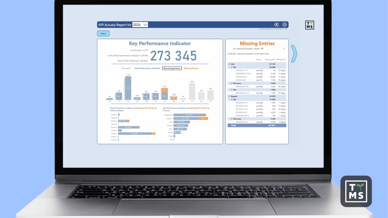
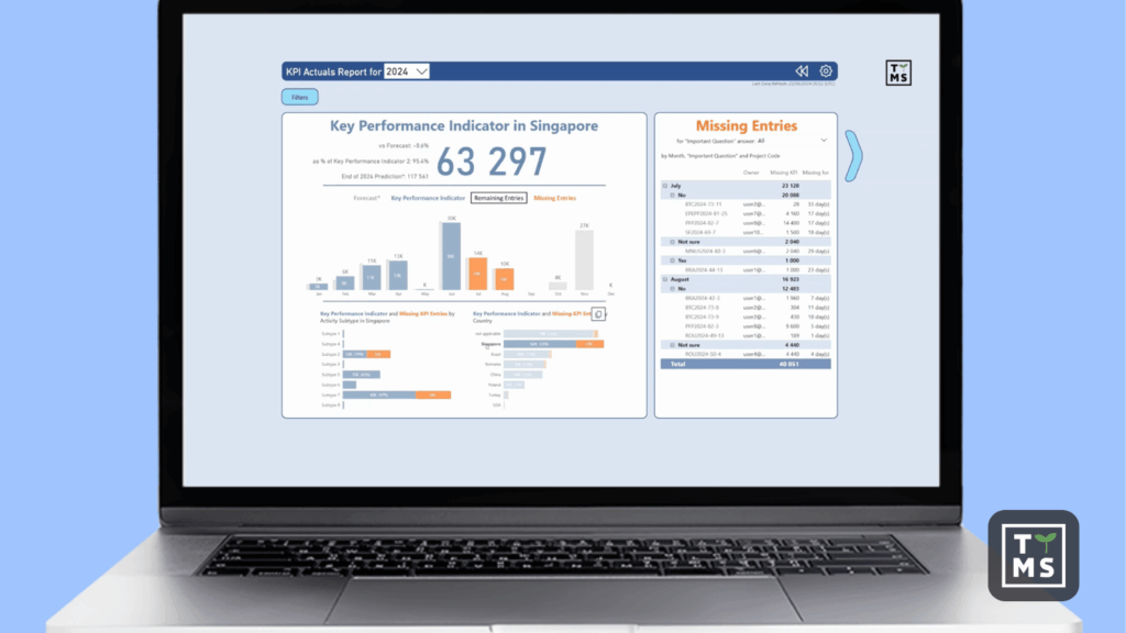
4.2.1 Meaning of colors in interactive reports
The orange color immediately highlights missing data, encouraging action. Once all information is complete, attention automatically shifts to KPIs and trends. TTMS ensured color consistency throughout the project—each color conveys meaning, creating a coherent visual language. Users quickly learn to interpret signals without the need for additional descriptions.
4.2.2 Font size and margins
Every element of the report has its own rationale – from the color scheme, through the placement of filters, to contextual tools (tooltips). Thanks to its well-thought-out structure, the report not only presents data but also suggests next steps and allows you to explore details without information clutter. Even the font size and margin layout have been optimized for ergonomic work.
4.2.3 What details are most important for the readability of an effective report?
It’s the details that build trust in the report. The TTMS team took care of:
- logical arrangement of elements and visual consistency,
- optimal information density that balances between transparency and data depth,
- scalable SVG graphics created in DAX, allowing you to bypass Power BI limitations and maintain readability regardless of resolution,
- a filter panel that synchronizes with the whole, increasing the efficiency of the report,
- automatic overlays informing about active filters that increase context awareness,
- and microinteractions that make it easier to navigate through the data, making the report respond naturally to user actions.
Importantly, TTMS placed emphasis on user education – the report itself teaches you how to use it. Built-in tooltips, iconography, and descriptive headings make it a digital decision assistant. As a result, every employee, regardless of their level of analytical expertise, can use it and understand the data.
The result? A report that doesn’t require a user manual. It’s intuitive, responsive, and tells you what to do next.
5. Power BI Reports – Your Organization’s Information Hub
After implementing the new system, the audit process was shortened several-fold, and the team gained a tool that truly supports their daily work. Users began using reports without being forced to do so, as they simply facilitated their decision-making. Managers saw in real time who had submitted data, who was late, and who had met all requirements. KPIs were available in real time, instead of weeks later, allowing for immediate corrective action.
In practice, Power BI reports became the organization’s new information hub. Management and operational meetings were no longer based on outdated Excel spreadsheets; instead, they relied on up-to-date data presented in a dynamic way. What was once a burdensome chore turned into a valuable asset – a true source of knowledge and competitive advantage. TTMS has shown that a good report isn’t the end of a project – it’s the beginning of a transformation in organizational culture.
5.1 The Effects of Effective Reports: From Barrier to Increased Engagement
Data has ceased to be a barrier and has become the language of communication between departments. Instead of email exchanges and misunderstandings, a shared analysis space has emerged, where everyone uses the same metrics. Marketing, finance, and operations teams can now operate based on a shared set of facts, not interpretations. The result is a faster response to change and better resource management.
TTMS has also noticed a side effect of this change – increased user engagement. Reports have become part of the workflow, not a “mandated obligation.” Users are eager to share their insights, suggest improvements, and participate in the system’s further development. Trust in data has increased, and decisions are made based on facts, not intuition.
5.2 Scalability and development
Thanks to the Power Platform architecture, the solution is fully scalable – it can be easily extended with new reporting and process modules, or integrations with other systems. The organization also plans to leverage this ecosystem in HR and finance, creating a comprehensive reporting environment based on a single data logic. This is an investment that grows with the organization, fueling its development and supporting subsequent stages of digital transformation.
6. Summary: The Philosophy of Effective Interactive Reporting
Power BI reports created by the TTMS team are more than just aesthetic visualizations. Digital products, which combine data, processes, and people into a single, cohesive experience. Their strength lies in their design philosophy: the user at the center, data at the service of decisions, and technology as a catalyst for change.
At TTMS, we treat reports as a tool for organizational transformation—not just a technological solution, but also an impetus for changing the way we think about data. Every project is a co-creation process with the client, where understanding their goals, challenges, and work culture is crucial. This ensures that the report is tailored to real needs, not just another analytical tool.
In a world where information is the most valuable resource, only well-designed reports can transform data into action. These reports not only demonstrate results but also help understand the context, causes, and directions for further development. Such reports strengthen trust within the organization, improve communication, and foster a culture of fact-based decisions.
That’s why TTMS creates reports that not only answer questions but also help you ask them. Each project is a step towards analytical maturity, where data becomes the language of business, and Power BI becomes a tool guiding the company towards intelligent, informed management.
If your organization is “facing chaos data”, contact us now. Unleash the potential of your people by giving them the tools to effectively analyze data. Stop guessing and act on the knowledge your organization already has, but just doesn’t see it yet.
Why do traditional reports fail in business?
Because they focus on data, not decisions. They are often overloaded with information, causing the user to lose track. A good report is one that simplifies complexity, provides direction, and suggests what to do next.
How does Power BI change the way we think about data?
Power BI enables the creation of interactive, dynamic reports that respond to user actions. This makes analysis a process of exploration rather than browsing static tables.
What makes the TTMS approach to Power BI reports unique?
TTMS treats reports as digital products. It’s a combination of analytical thinking, user experience, and business understanding. Each report has a clearly defined purpose, structure, and user interaction.
What are the effects of implementing the TTMS philosophy?
Higher adoption rates, faster response times, improved data quality, and a real shift in work culture. Reports are no longer a chore, but a daily decision-making tool.
Why is it worth investing in effective Power BI reports?
Because it’s an investment in understanding your own business. A good report allows you to see what wasn’t visible before – and act faster than your competitors.